Website Modernization
Digital Experience Redesign
A strategic elevation of DMK's digital presence — preserving every credential, every relationship, every word of substance — while transforming how the world perceives the firm on first impression.
Daniel, Medley & Kirby, P.C. has served Southside Virginia for over a century. The firm's reputation — built across generations, reinforced by an AV Martindale-Hubbell rating, Best Lawyers recognition, and trusted relationships with institutions from Averett University to the Virginia Attorney General's Office — is beyond question.
The firm's current website, however, does not reflect the caliber of counsel that walks through its doors. It presents the correct information but within a dated framework that undersells the firm's authority. In an era where prospective clients, referral sources, and recruiting candidates form their first impression digitally, the gap between DMK's actual standing and its online presence represents a measurable strategic disadvantage.
The proposed redesign preserves 100% of the firm's existing content, practice area descriptions, attorney credentials, and legal information. What changes is how that content is presented: the visual hierarchy, typography, spacing, navigation flow, and overall experience.
An assessment of the firm's existing photography — what we're working with, what can be enhanced, and what the modernized site needs.
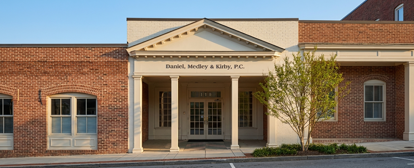
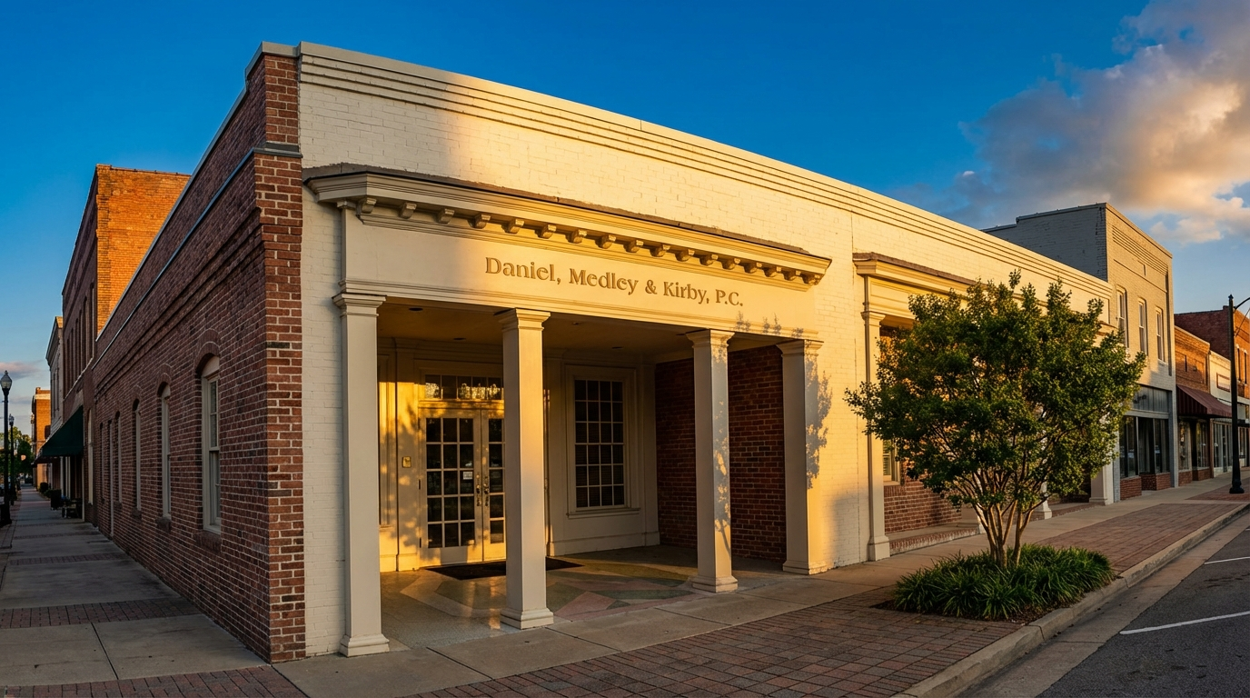
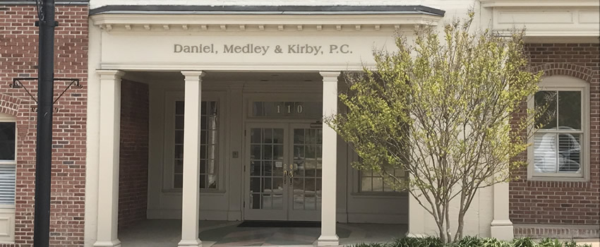
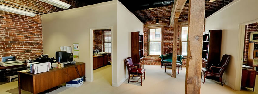
The firm has two strong office images that convey character and permanence. The Danville exterior at 110 North Union Street is particularly effective — the columned entrance, brick facade, and firm name signage project established authority. The interior shows exposed brick walls, wooden beams, and traditional furnishings that reinforce the firm's commitment to historic preservation.
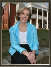
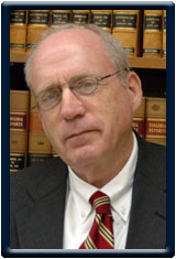
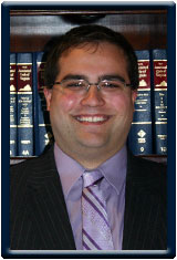
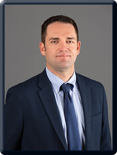
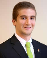
Seven of eight attorneys have photos on the current site. The images vary significantly in quality, background, lighting, framing, and era. T. Brent Gammon's headshot is the most modern (studio gray background, professional lighting). Others range from office settings to outdoor locations to law-library backdrops — many with dated digital borders.
For the modernized site, we will integrate these existing photos with CSS-based normalization — consistent cropping, subtle grayscale treatment, uniform aspect ratios, and gentle contrast adjustments — to create visual cohesion despite the original differences.
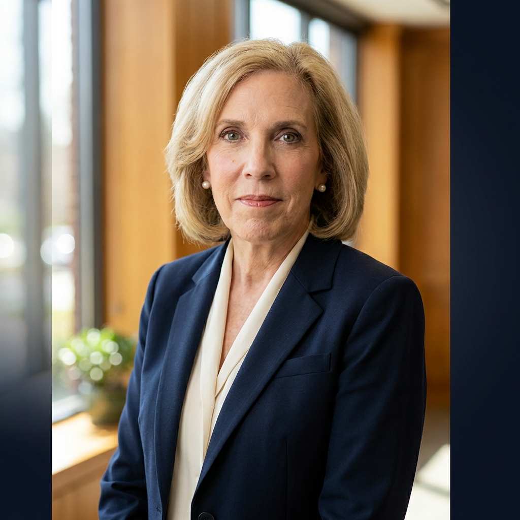
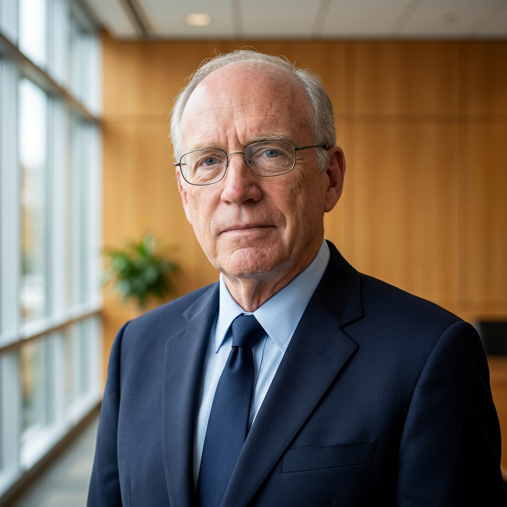
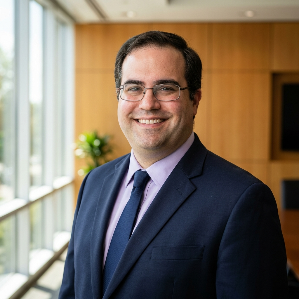
All attorney headshots have been AI-enhanced with consistent studio backgrounds, professional lighting, and uniform framing. The key advantage: visual consistency — all headshots now share the same aesthetic, which creates a more professional, cohesive team presentation.
These are concept versions to demonstrate the visual direction. They can be replaced with professional studio photography, or we can refine the enhancements to better match each attorney's likeness.
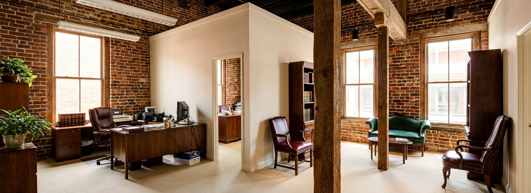
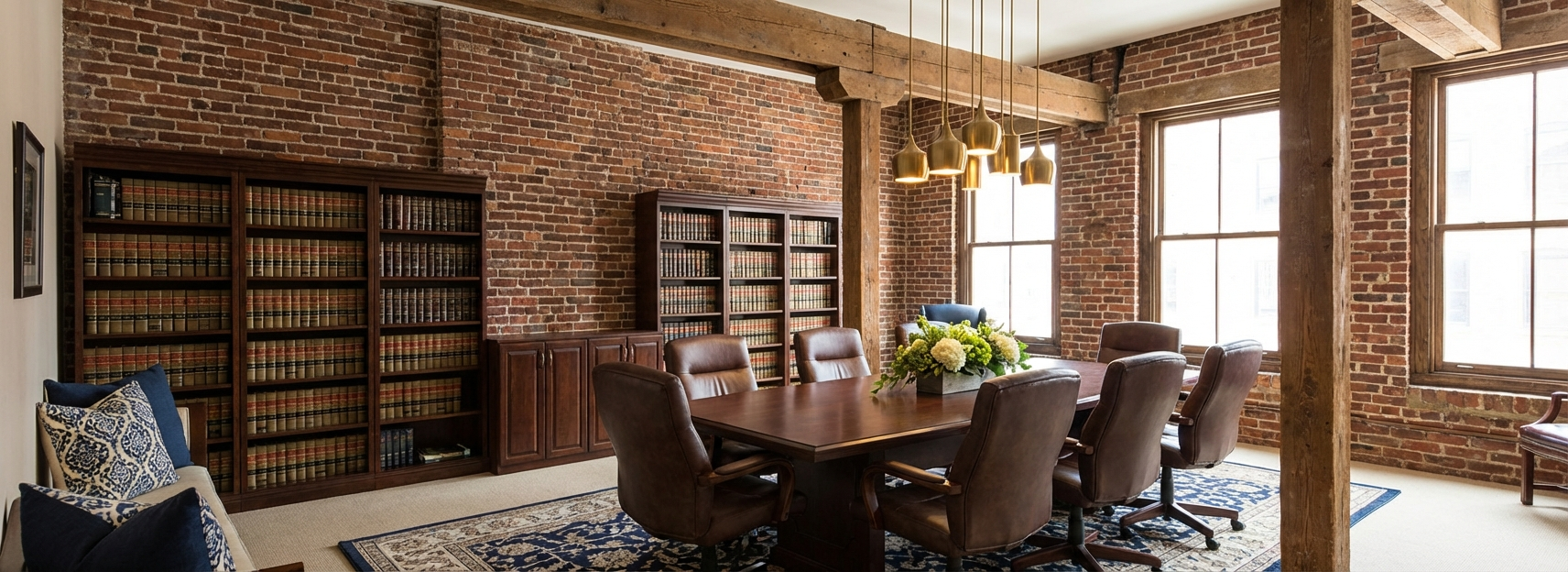
The images below are concept visuals demonstrating the aesthetic direction and editorial quality we envision. For the final website, these would be replaced with professional on-site photography — capturing the firm's actual building, interiors, and spaces with the same attention to lighting, composition, and atmosphere shown here.
Realism is key. Authentic photography of your historic Danville office will create a far more compelling impression than concept imagery.
A design philosophy rooted in restraint, confidence, and timeless craftsmanship — inspired by the world's most refined digital experiences.
The most authoritative brands in the world share a common quality: they never shout. Their confidence comes from restraint — from the deliberate choice to let substance speak. The redesigned DMK website will embody this principle.
Every design decision is governed by a single question: Does this earn trust? If it clutters, it is removed. If it distracts, it is simplified. If it dates, it is replaced with something timeless.
Generous whitespace between sections creates breathing room that signals confidence. Content is never crowded.
A serif/sans-serif pairing creates a tone that is both authoritative and modern — like a well-edited journal.
Navy, charcoal, white, and soft gray form the foundation. A muted gold accent adds warmth without excess.
Elements fade gently into view. Nothing bounces or demands attention. Motion reinforces hierarchy.
Clean grid-based sections allow content to be updated independently. Each block serves a clear purpose.
Authentic office and attorney imagery — never stock photos. CSS treatments create cohesion across existing assets.
A clear, logical page structure that guides visitors from awareness to confidence to contact.
The front door. Uses the office exterior as hero background. Establishes authority, communicates breadth, and creates clear pathways to deeper content.
Full history since 1920, mission statement, notable clients (Averett, VDOT, AG Office), community involvement, and service area. Interior photography featured prominently.
Photo-driven directory leading to rich individual profiles. CSS-normalized headshots create visual consistency.
18 practice areas displayed as scannable cards. Each area links to a detail page with description and linked attorneys.
Firm updates, attorney recognitions, and community events. Keeps the site current.
Conversion point. Both offices with maps, contact form with practice area selector, tap-to-call on mobile.
A fully rendered preview using the firm's actual photography, proposed typography, and defined color system. Real headshots. Real office imagery. This is the design.
The foundational elements that create the visual tone — every heading, every paragraph, every accent governed by a strict system.
The type system pairs Playfair Display — a refined transitional serif with old-world gravitas — with DM Sans, a clean geometric sans-serif. This creates an editorial tone that is authoritative but modern: the legal equivalent of a well-bound brief.
Deliberately restrained — a foundation of deep navy, warm charcoal, and clean white, with a muted gold accent used sparingly.
Every interaction is purposeful. Motion reinforces hierarchy and confirms action — never decorates or distracts.
object-fit: cover, subtle grayscale (20%), and gentle contrast boost. On hover, photos transition to full color with a slight scale-up. This creates visual cohesion from seven different photo sources.cubic-bezier(0.16, 1, 0.3, 1) for natural deceleration. Intersection Observer triggers at 15% visibility.prefers-reduced-motion respected.Hover to preview proposed interactions.
Practice areas, attorneys
translateY(-3px)Nav active, list items
border-left: 3px goldPrimary buttons, CTAs
background 0.5s easeScroll reveal entrance
opacity + translateYA beautiful website that nobody can find is a failed investment. The technical foundation ensures discoverability, speed, and conversion.
Proper structure for maximum search engine comprehension.
Rich structured data for the firm.
Fast loads improve rankings and UX.
Real photography delivered efficiently.
Strategic cross-linking distributes authority.
Critical for Danville/Martinsville visibility.
A direct comparison of where dmklawfirm.com stands today and where the modernization will take it.
This proposal preserves every word of substance that Daniel, Medley & Kirby has earned — every credential, every relationship, every year of service. What changes is how the world sees it. The modernized website will be the firm's most effective introduction: calm, confident, and worthy of the trust that Southside Virginia has placed in DMK for over a hundred years.
A clear, fixed-fee engagement to modernize DMK's digital presence — no hourly surprises, no scope ambiguity.
To proceed, please reply to this proposal or contact us directly. We look forward to partnering with Daniel, Medley & Kirby on this elevation.